|
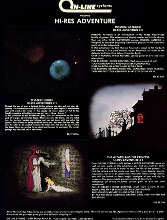
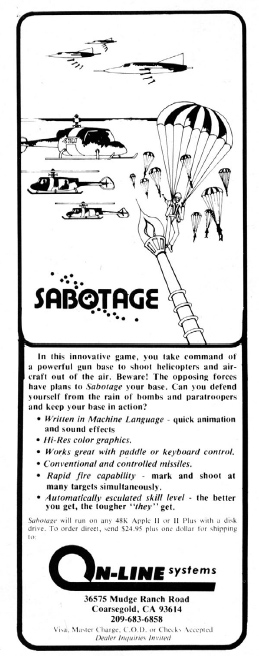
This post will be adding some more details and some of my own aesthetic analysis to my last post, Illustration in Video Game History. I've been extraordinary lucky to have caught the attention of Roberta Williams' brother-in-law, John Williams (Ken Williams' brother). John managed most of Sierra On-Line's marketing, especially in the very early days when the whole enterprise was basically under his charge. He watched my Provost Talk, felt that my analysis resonated with him, and has been kindly letting me pick his brain about Sierra, particularly their marketing. Following up on some questions illustration dealer and historian Robert Reed has asked in the comments section of the last blog, about how much Sierra paid for these illustrations: According to John, the very earliest stuff was (roughly guessing 1980-1982) was done for around $100 a pop (about 40 bucks today), and mostly composed by local high schoolers and rouge Coarsegold hippies (see examples of some early 1981 On-Line ads below).
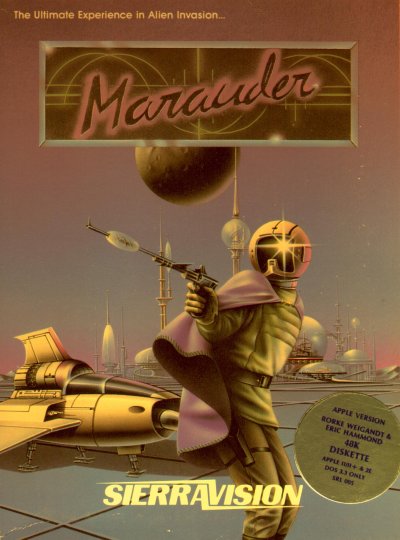
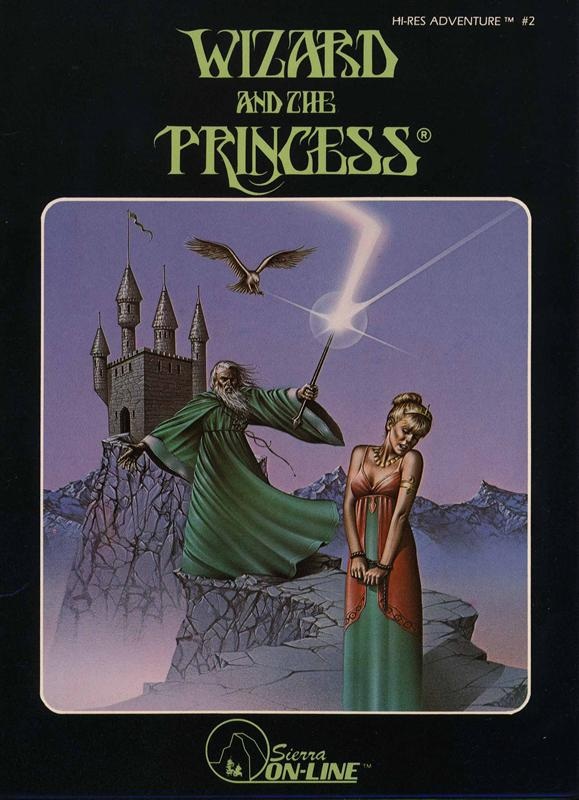
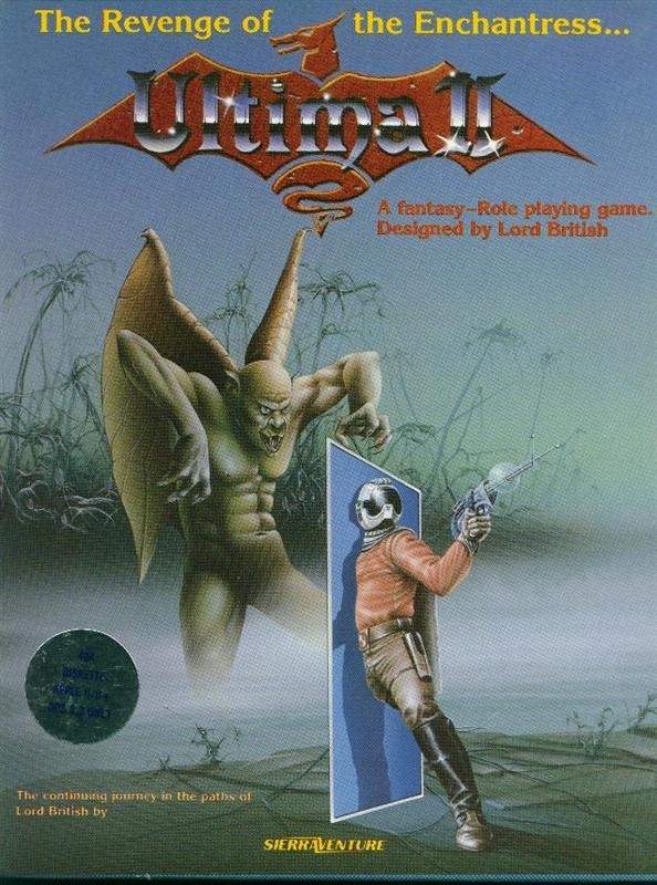
The Stinson piece, however (see my last post) which is from 1984 and part of the black box releases of the Hi-Res Adventure series, was commissioned at about $800-1000, according to John Williams. Inflation calculators tell me this about about the equivalent of $2000 - $2400 then, or $300 – $380 now--which sounds about right, although low, for the quality of the work, but perhaps Roger Reed will correct me on this? These prices were inclusive of full license to reproduce the work on boxes, ads, promotion, etc. John Williams has also informed me that Stinson also did the artwork for the computer arcade-style game Marauder (1982), and possibly Ultima I and II (1983 and 1982, respectively, see explanation below), as well as some of On-Line's competitors.
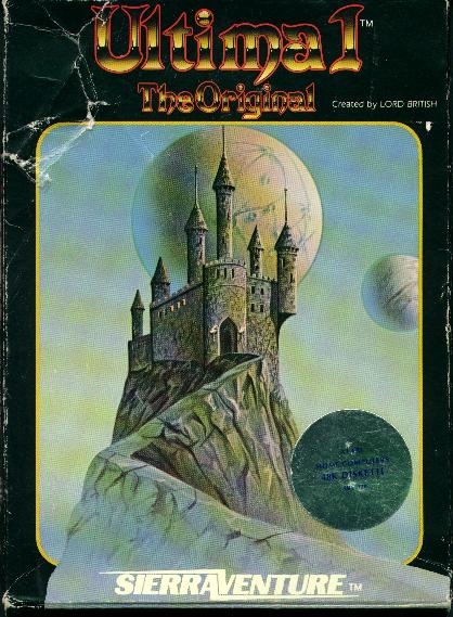
My assessment of these covers is formally speculative, I'm not an expert at these matters, but do have a BFA in graphic design that helps inform my readings. So, it's a fact that Ultima I and II had the same artist—the castle from the Ultima I box is actually just from the back of the Ultima II box (see back and front of Ultima II box here). Sierra's Ultima I came a year AFTER the Ultima II release, because it was simply an Atari 8-bit port of the game, which had been originally published in 1981 for the Apple II by California Pacific Computer Co.
I struggle to decide whether Stinson was also the artist on the Ultima games. Marauder's main figure has a similar ¾ posture to the figure in Ultima II, and the helmets and guns strongly share stylistic qualities. However, the Marauder figure's pose is much more awkward (as are those of The Wizard and the Princess). Very stiff, physiologically improbable, and the detail in the clothing is overworked. By contrast, the foreshortening of the left thigh in Ultima II shows a good degree of competence with drawing human anatomy--whereas Marauder and W&P seem to purposefully avoid the more natural poses that would require foreshortening of the legs. Yet again, the foreshortening of the gun arm in Marauder is much stronger than the over-cocked arm in Ultima II. I'm not sure how to read that a-genital winged troll/orc thing—part of what might be tripping me up is a difference in materials used, as I realize now that I can't tell if these covers are brush painted or airbrushed. The castle on the back of the Ultima II cover seems telling to me. While very structurally similar to that of The Wizard and the Princess--with its tropey fantasy illustration standards of turrets, flagpoles, jagged stone walkway and the balancing presence of a spherical object in the sky (the wizard's blast in W&P, a moon in Ultima II)--the Ultima II castle is much more convincingly rendered, the atmospherics more smooth, and the outline of the castle against the sky less jarring. Given that The Wizard and the Princess cover was painted in 1984, and the Ultima II cover designed in 1982, I'd actually argue that what Stinson did was a riff on the work of whoever did the Ultima II cover (or maybe he was just paid a ton more; Ultima II was a HUGE deal, and Richard Garriot demanded invested, professional packaging and marketing--which I guess shows you what the standard was in the early 1980s). Was Stinson just cheaply copying his previous Ultima work for The Wizard and the Princess? Would love feedback from what others think who are versed in these matters—I'm always in the mood to refine my aesthetic detective skills! I'd also be interested to know, from players, if these settings actually represented real locales in any of these games (was there a castle far away on a stone walkway? a swamp?) With all my writing, I've not yet gotten around to playing The Wizard and the Princess--although I know, at least, to LOOK at rocks and watch out for scorpions :)
Roger Reed
1/25/2013 02:55:00 pm
Your analysis sounds sharp to me. There are stylistic clashes where the artist shifts from brush to airbrush within the same picture (Ultima II, esp.) and Stinson is copying himself with those clunky cloned castles (though that might have a specific branding purpose) because whatever was successful gets called back for more. Comments are closed.
|
Archives
March 2020
Categories
All
|
 RSS Feed